The front cover of our new issue looks a bit different this month. Editor Carey Davies explains the changes.
The Great Outdoors is the original mountain magazine. We’ve been publishing the best content on hiking, hillwalking and backpacking for 44 years, and we’re embarking on an exciting new stage in our long-distance trek across the decades.
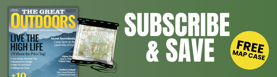
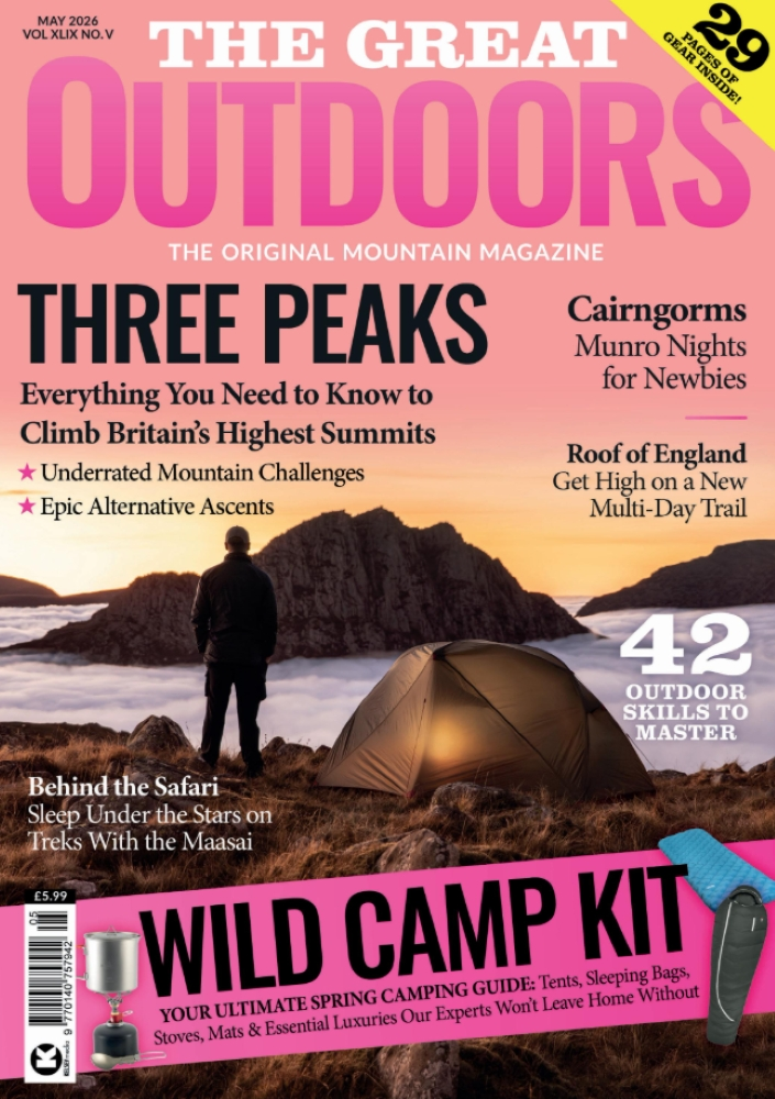
If you’re a regular reader, you’ll probably have spotted that our new issue looks look a bit different. After a good while in development, we’re proud to unveil our brand-new cover style and logo. It looks better in all its real-life glory, of course, but here it is in digital form…
We’ve aimed to strike a balance between continuity and change. Our new logo is not a million miles away from our old one, but we think it does a better job of conveying what we’re all about: open spaces, wild places, and soul-restoring adventurous freedom.
At first glance, you might look at those fonts and think of the wide expanses of the American west, maybe the gleaming granite heights of the Sierra Nevada or the wild drama of the Rockies.
This is deliberate – we are a British magazine (with a natural, but not exclusive, lean towards the Highlands of Scotland, where most of Britain’s mountains congregate); but our spiritual inspiration has always drawn from influences over the Atlantic, and that school of thought which gave birth to national parks, long-distance trails and the ‘outdoor movement’ as we know it.
However, there are inspirations closer to home, too – those posters from the early 20th century promoting mass trespasses in the Peak District, for example, which did so much to blaze a path for the right of access to British mountains that we now enjoy. So if that logo also makes you think of the earthy gritstone and peat bog of Kinder Scout, that’s certainly a good thing in our book.
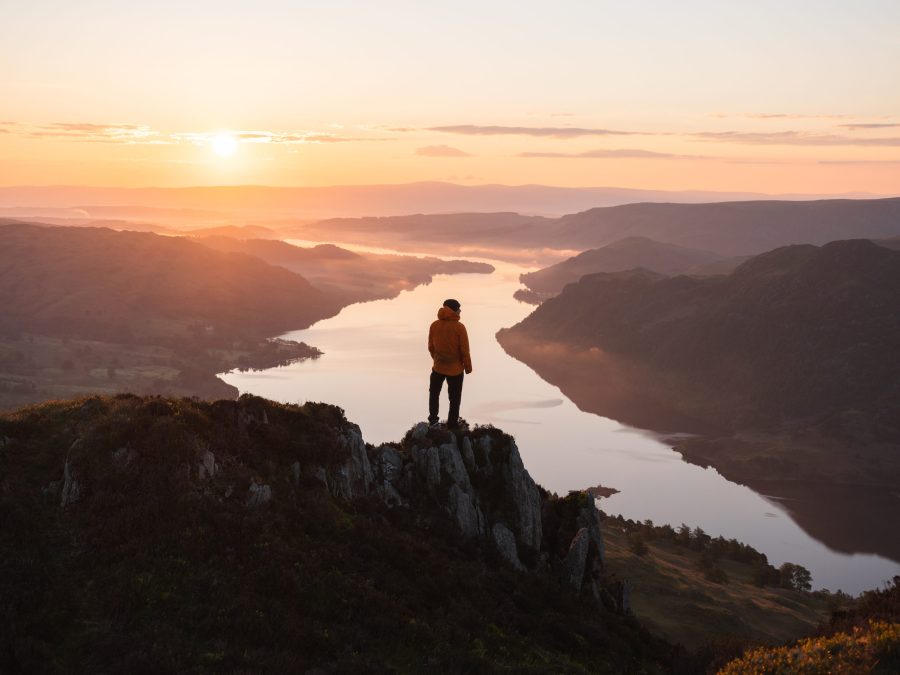
Our overall cover format has also gone through a few changes too (many thanks to photographer Daniel Toal for capturing the wonderful Lake District imagery that gets this new look off to a spectacular start). And whilst we haven’t altered much else inside the issue this month – there’s only so much you can do in one four-week cycle! – these visual changes shouldn’t be seen as simply cosmetic. They are one, albeit noticeable and symbolic, part of a wider process of overhaul that has been going on for the last couple of years.
 These changes have meant that – even despite the pressures of the pandemic – our circulation has gone up, our online audience and output has grown, our contributor base has expanded and diversified, our content has evolved, and revenues are in a healthy place. Anyone forecasting the death of magazines should take note – this one is going strong.
This has been a collective effort – a big thanks is due to The Great Outdoors core team, the wider pool of contributors, and of course, our loyal and much-valued readership (a surprisingly large number of whom have been with us from the start!)
There are a few more tweaks on the way, so watch this space. But, ultimately, our core values are the same: thoughtfulness, authenticity, independence, and deep awe at – and respect for – the natural world. The way we project those values is evolving, as everything must, but they remain as relevant as ever.