The Scottish Avalanche Information Service have begun their daily forecasts for the 17/18 season. Here’s how to use them
Every day between now and the end of the winter season (usually deemed to be some point in April), the SAIS will publish detailed avalanche reports and forecasts for the following areas of the Scottish Highlands:
Each report includes observations on local weather influences, snow stability and general mountain conditions from expert observers who have been out on the hill and inspected what’s going on for themselves. The SAIS combines these observations with their own expertise to come up with an Avalanche Hazard Forecast, presented as a colour-coded chart with accompanying remarks.
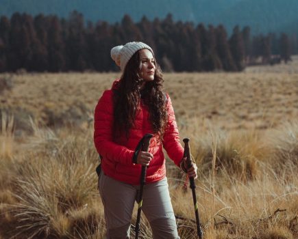
While the SAIS covers the most popular areas of the Highlands, it’s important to remember that conditions can be highly localised and the SAIS cannot hope to provide comprehensive coverage of every mountain even within the areas they monitor. That’s why it’s important to carry out your own avalanche assessment during the course of a day on the hills.
How to interpret avalanche forecasts
An SAIS forecast may look complicated, but it’s easy to understand once you get the hang of it. The diagram is presented as a compass rose with concentric rings representing altitude. Each segment is assigned a colour, ranging from green (generally stable) to red (highly unstable).
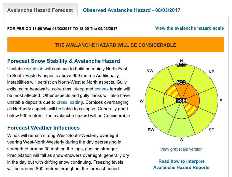
An example report from last season. In this case, the area of greatest avalanche hazard is forecast to be N to E slopes above 900m, although pockets of instability are indicated elsewhere. Safest slopes are forecast to be SW and S slopes at all altitudes.
At a glance, this diagram can give you a huge amount of information about likely conditions on the hill, but it’s best interpreted alongside the remarks printed to the left.
A more detailed guide to interpreting avalanche reports can be downloaded here.